Internal Branding
Service Innovation
Centre of Excellence
Redesign & branding
Centre of Excellence
Redesign & branding

The Overview
Here's the problem
There is currently no communication standard put in place in terms of conveying the message of CoE’s roles and offerings. The graphic diagram that currently exits to convey this message, does not effectively communicate what the CoE team and its partners actually do to internal and external parties. The diagram is unclear, unnecessarily detailed, and overwhelming to look at.
The Solution
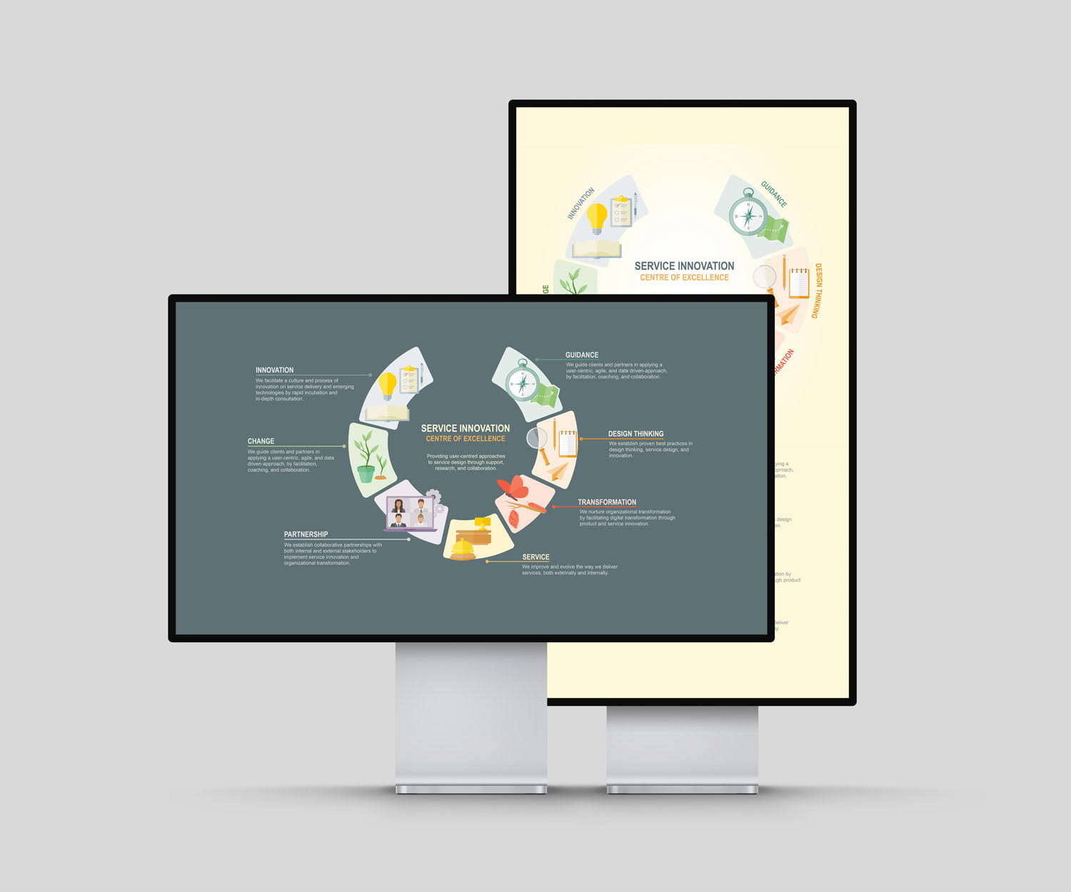
A unified look and feel to each element of communication will establish a clear brand identity and make the team recognizable. With more than just one communication tool being used, the message will be conveyed effectively and in an easily digestible manner.
The Ideas from my Brain
Sketching sketches
When researching the content for the CoE, a few themes were discovered to have been the most informative. These themes gave more of an understanding of what the team can offer than the original content of the placemat. Concepts were created to visualize each theme. Various symbols were sketched out to represent each theme.
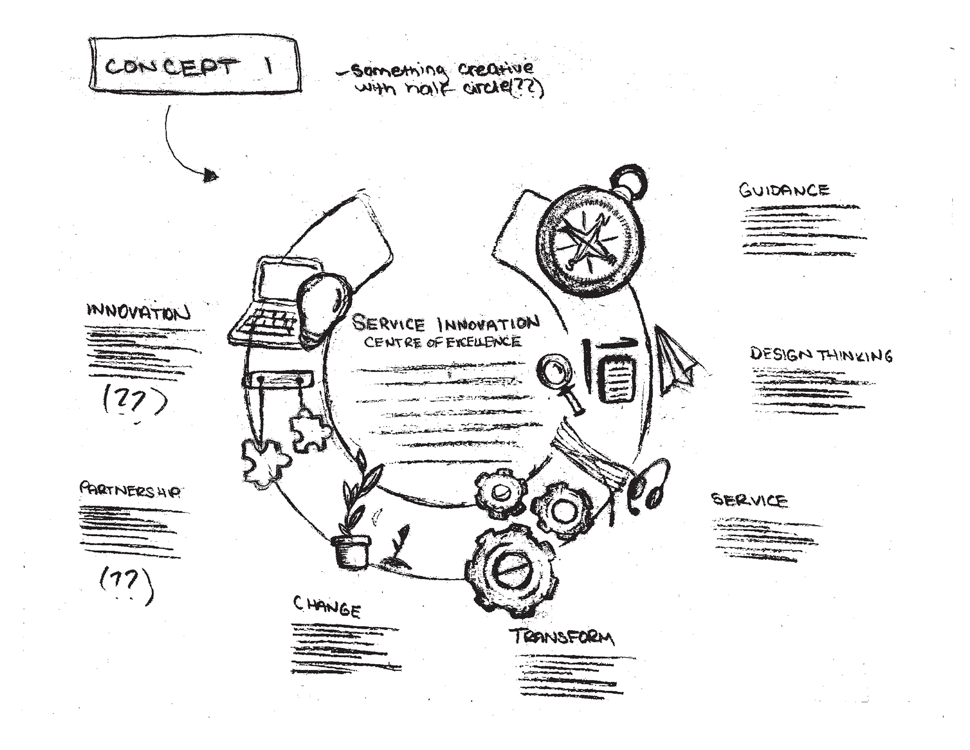
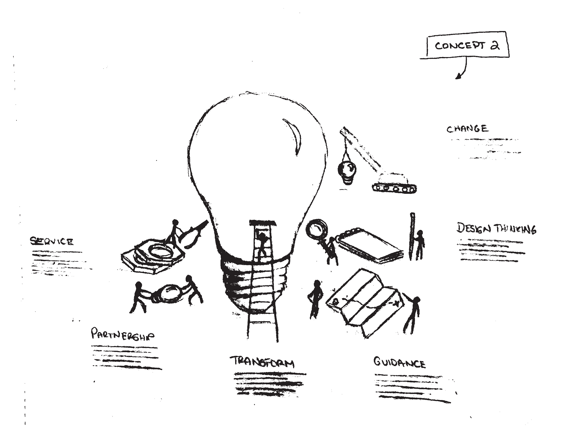
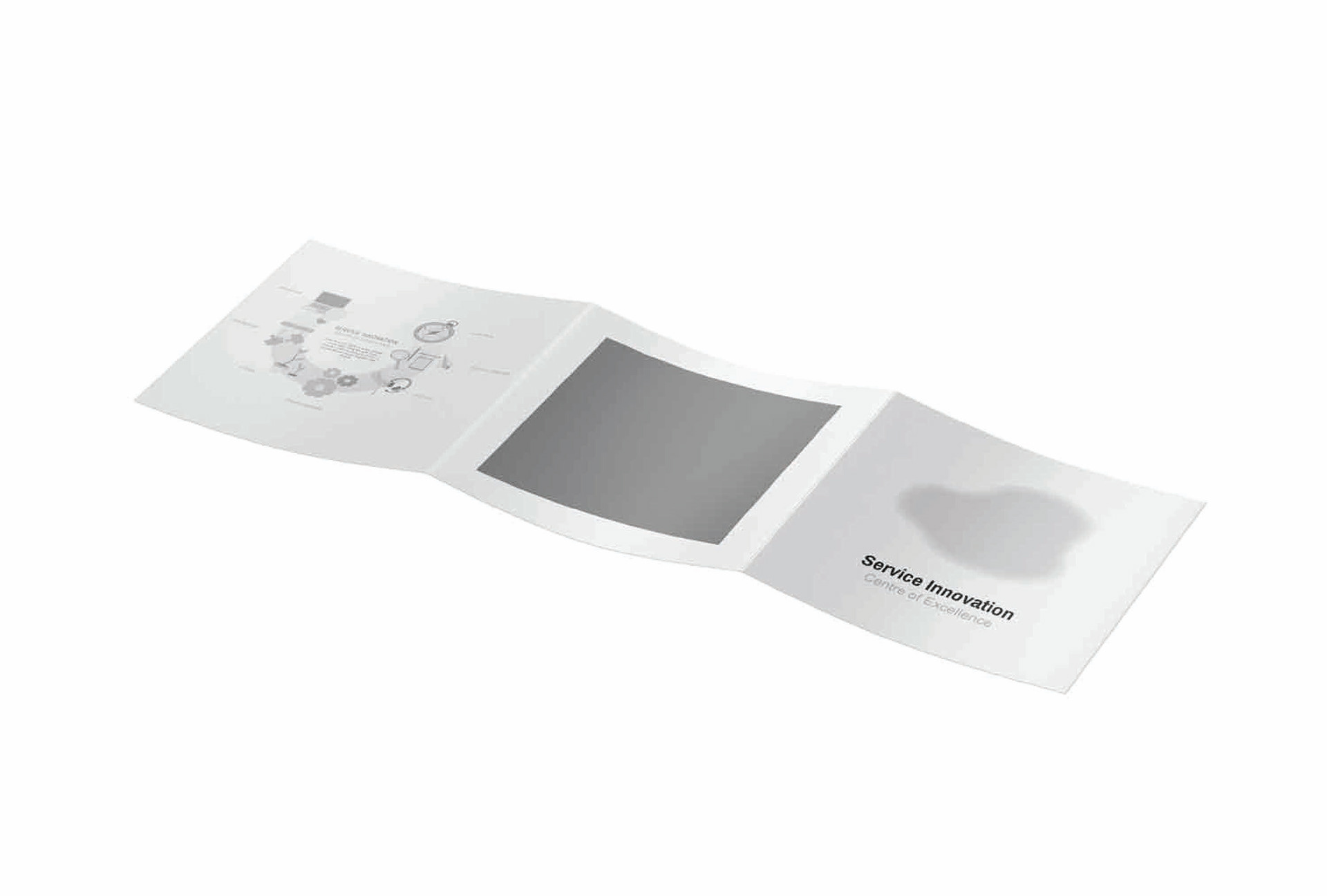
The first iteration was meant to act as a wireframe for the communication elements. This includes grayscale models of each communication tool.
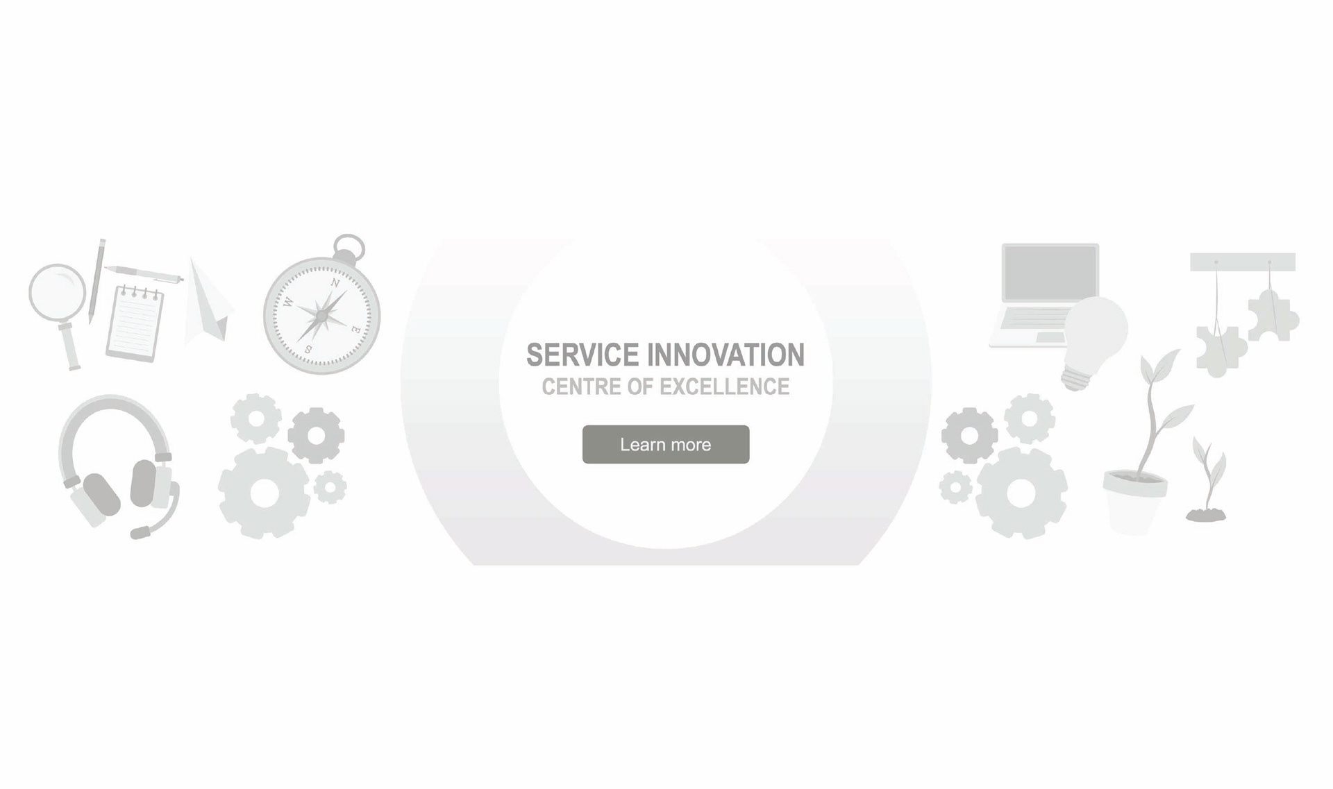
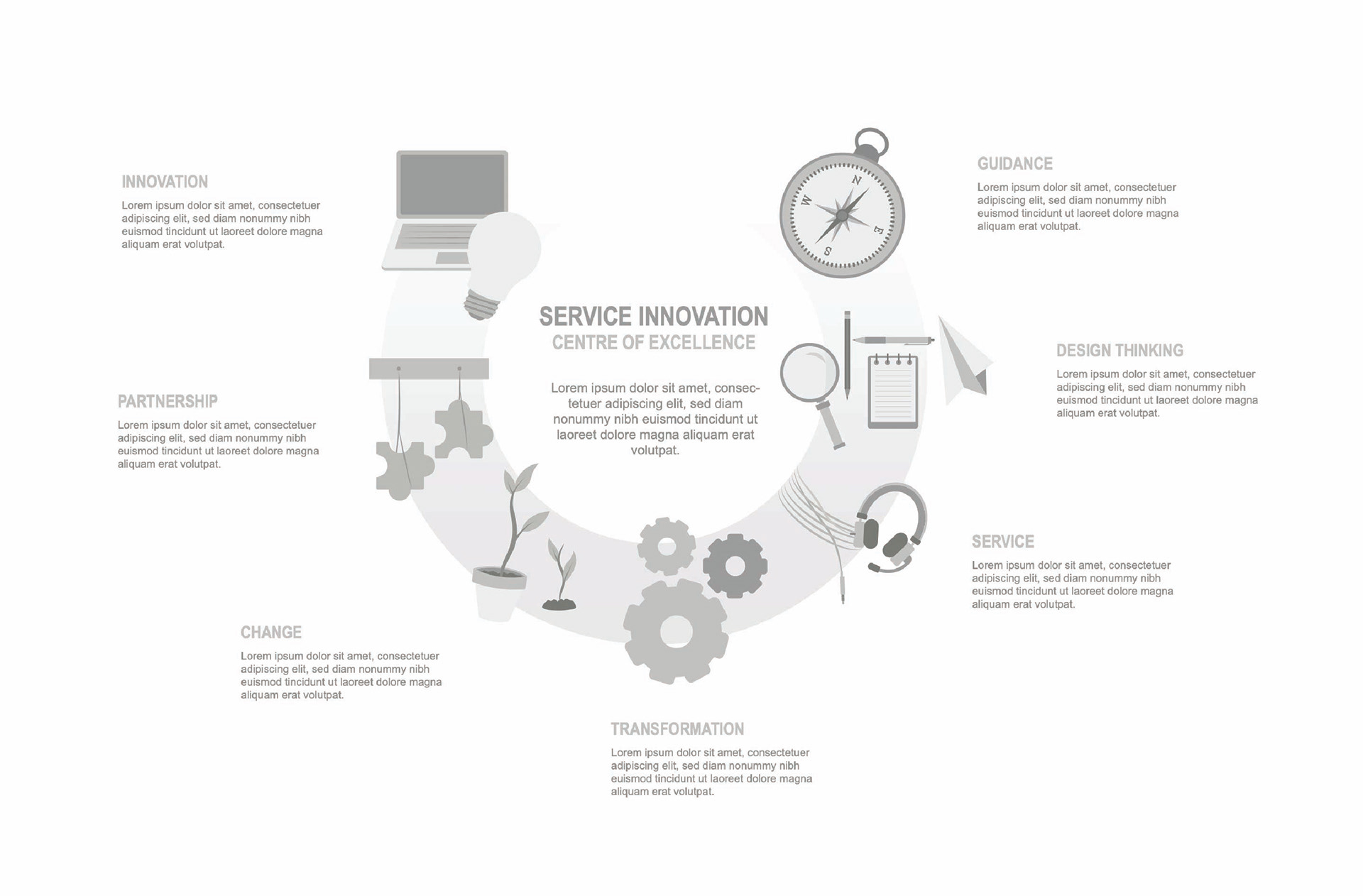
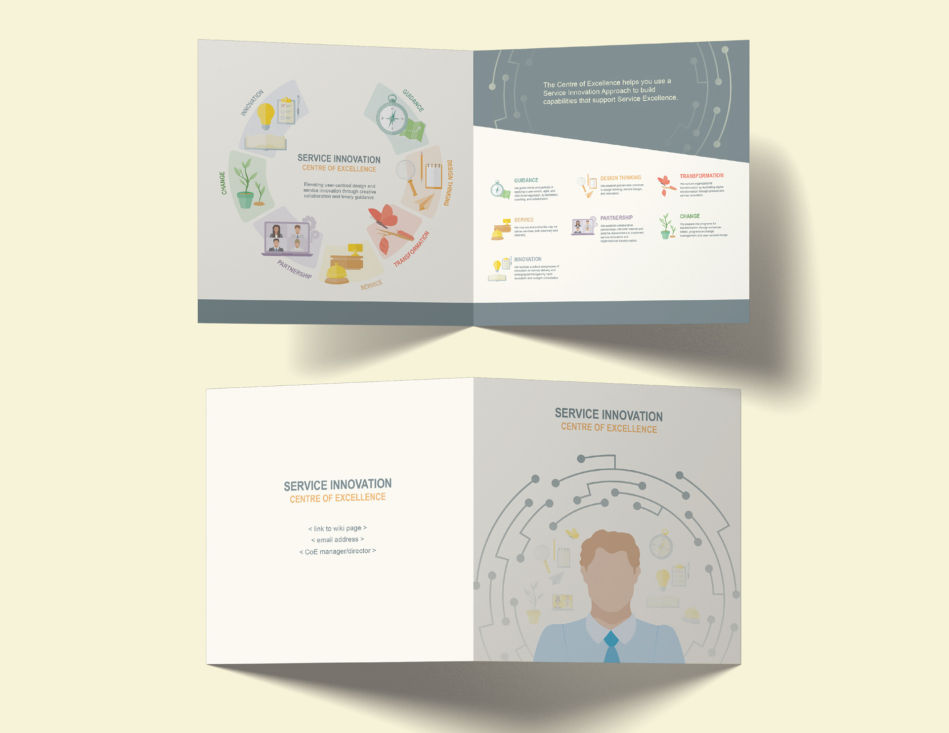
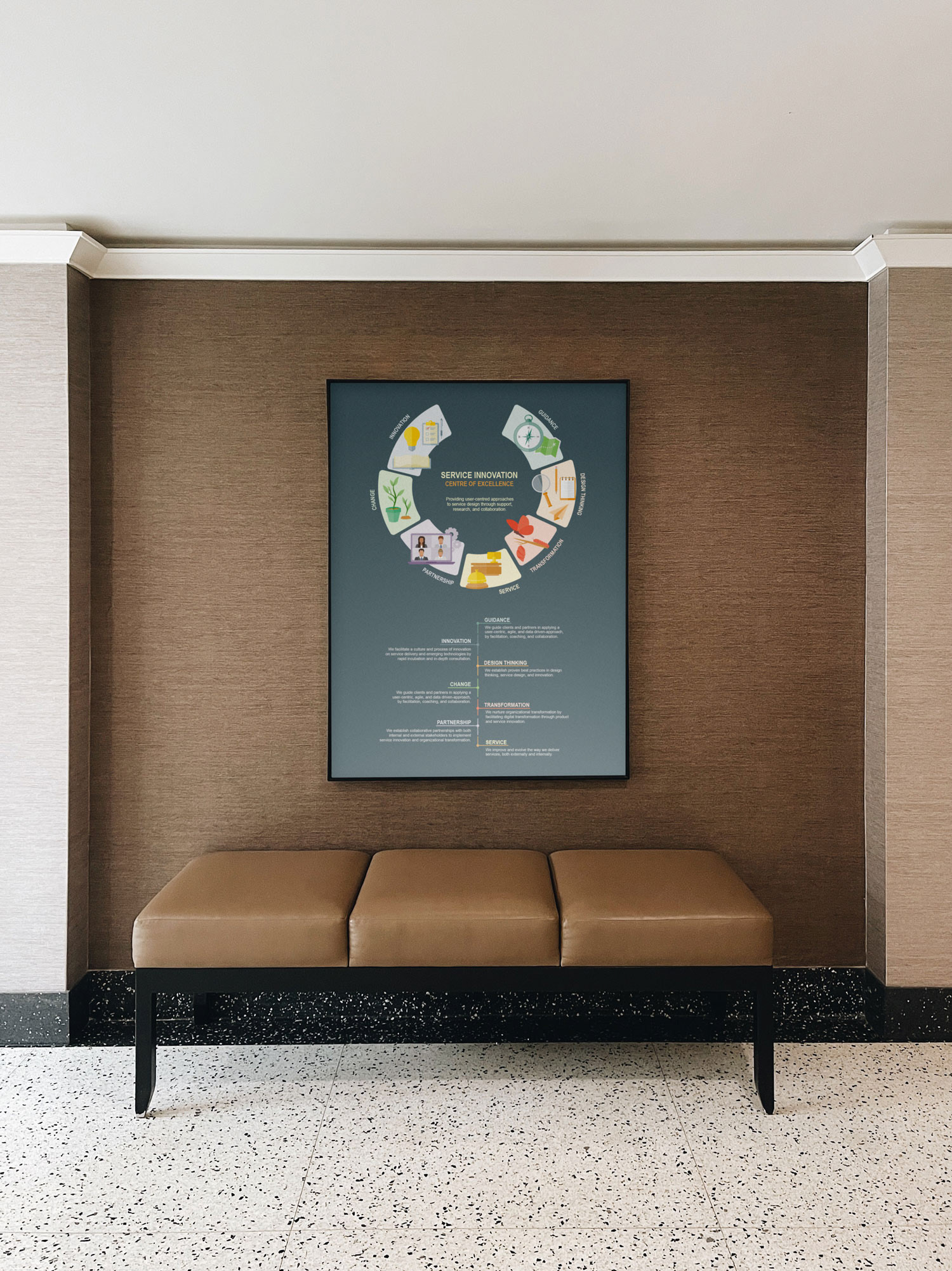
The final graphic is an identifiable image that is clear and informative. Each theme has its own corresponding symbol(s) that can resonate with the audience; making it memorable and recognizable to the department.
The Process
Colour Palette
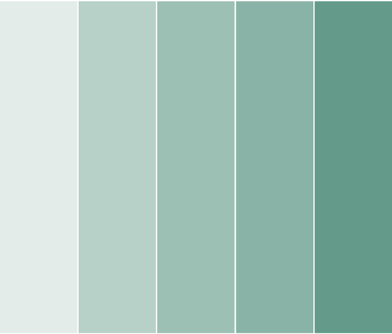
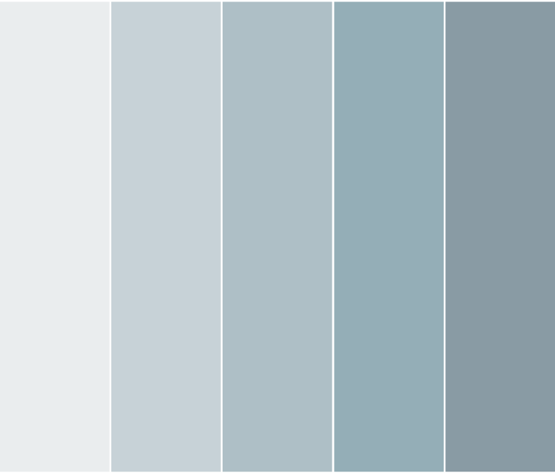
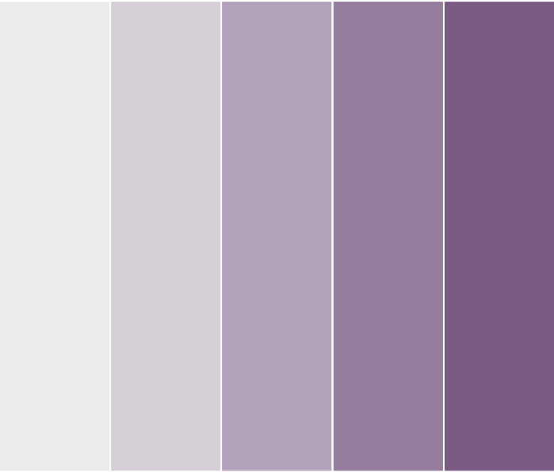
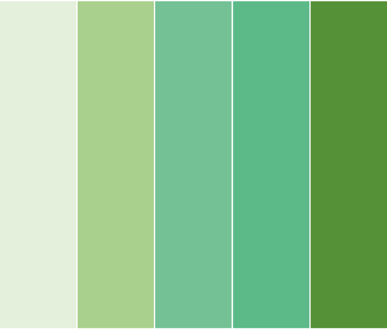
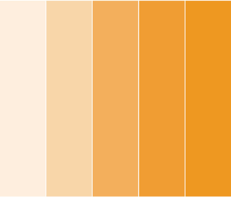
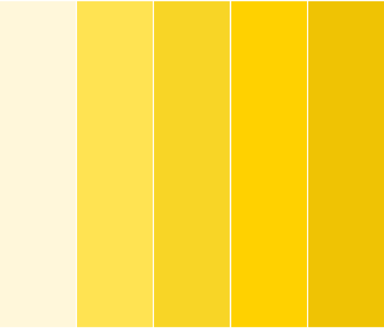
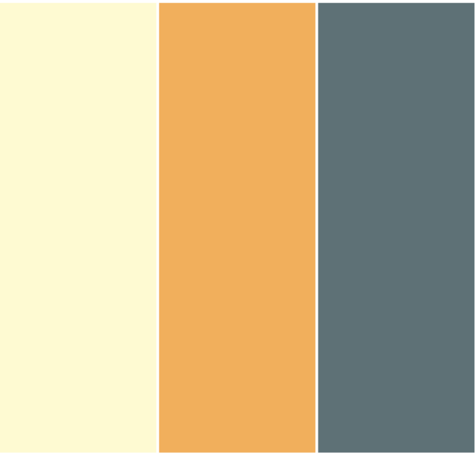
Each theme of the design has a different colour palette. Each palette has variations of the same colour. This helps in distinguishing a clear separation of one theme from the other. The overall colour theme for the identity of the CoE also works well when incorporated with the other colours. The theme is muted, however the colours stand out when paired together.
Typography
Arial Narrow was chosen for the headings as it is slim enough to fit lengthier titles, but also complimentary to the body copy. Arial Regular was chosen for the body copy as it is clear and legible on both web and print. Both fonts were chosen for accessibility to users and the team.

The Outcome
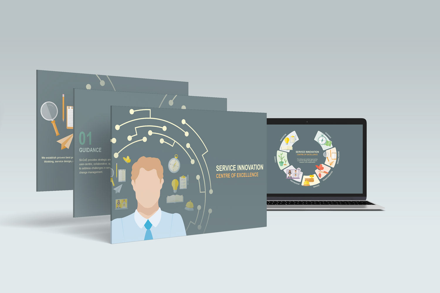
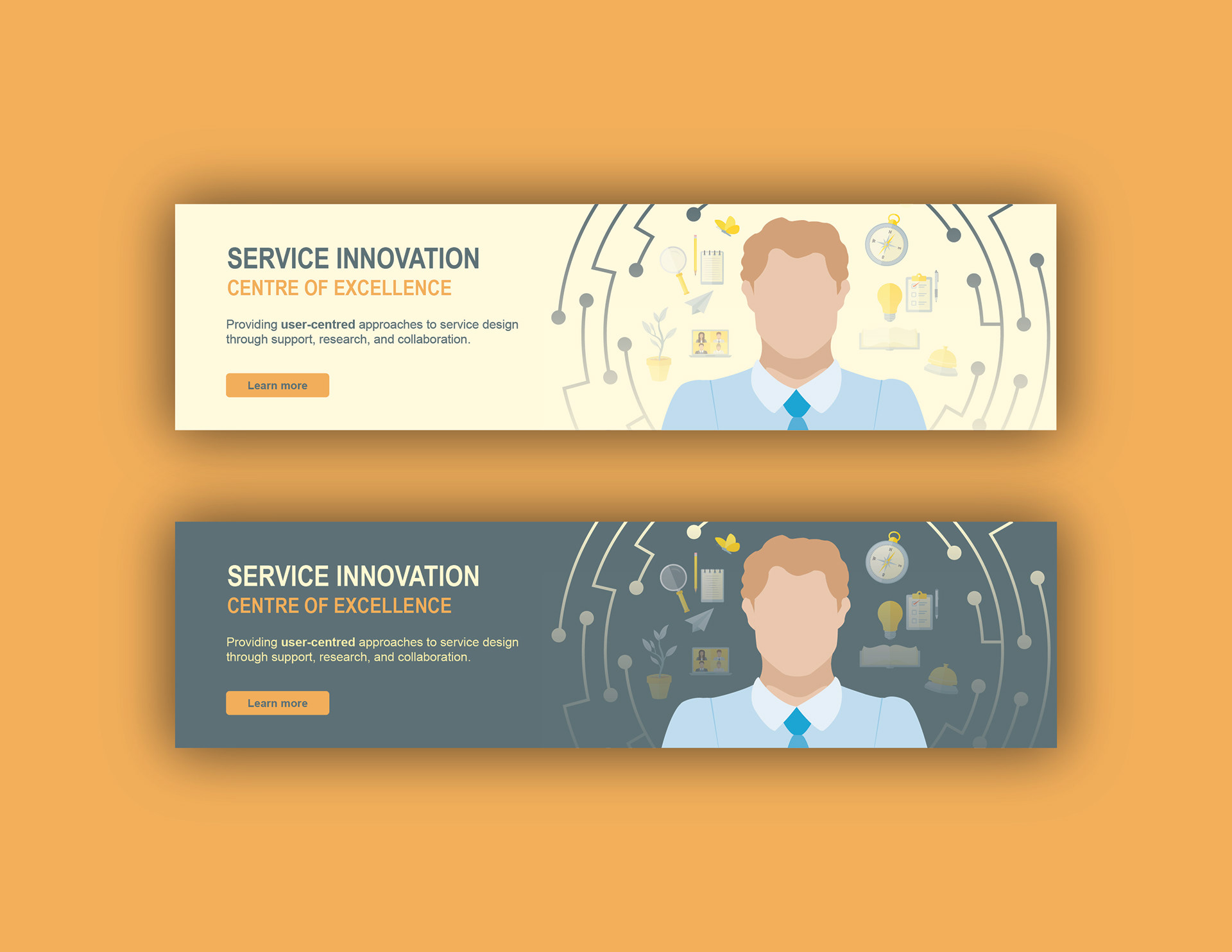
Here's what the finished product looks like
The communication tools compliment one another as a unique set of informative images. Everything is unified & connected. As each theme has its own symbol/image, it’s more likely to be remembered by clients that are viewing. Repetition also helps. With the implementation of an illustrative, yet informative communication plan, CoE can become identifiable to its internal and external clients.